10 YEARS OF THICK AS THIEVES
MOTION BRAND IDENTITY REFRESH

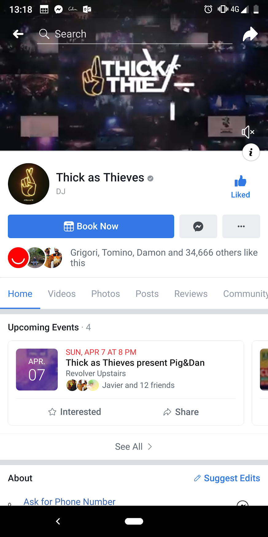
Based in Melbourne, Thick as Thieves agents search the globe looking for the most exciting underground music artists of today, to tour around Australia. For their 10 year anniversary I was commissioned to update the brand identity to reflect their momentous occasion.
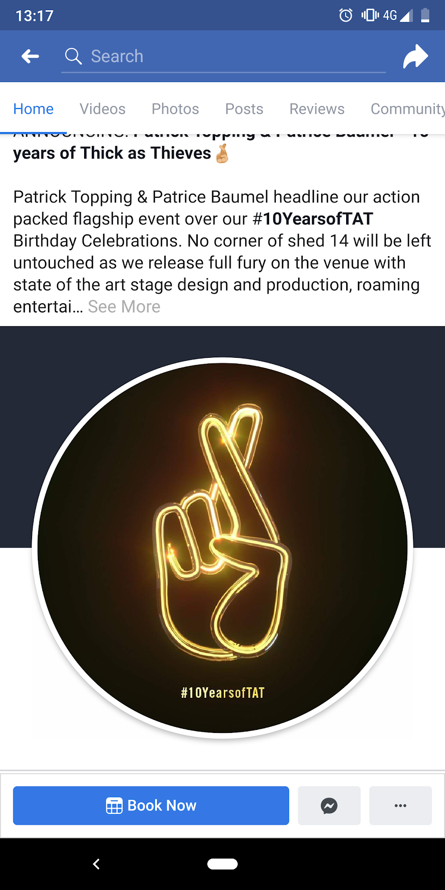
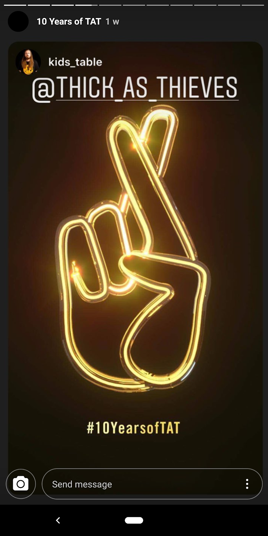
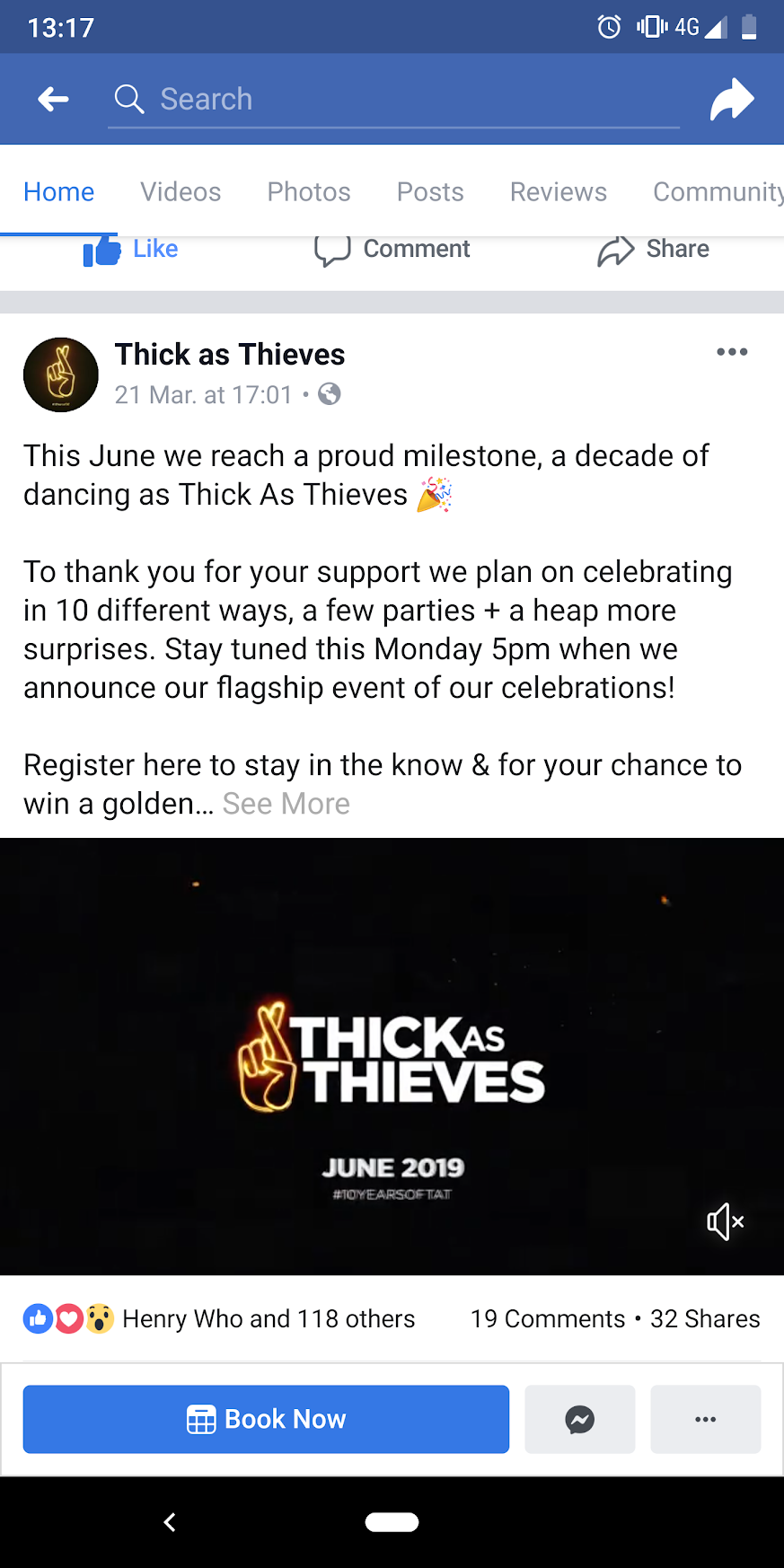
The brand identity's logo was updated with a tungsten and neon light look and feel. Which reflects live show stage production lighting they use in many of their shows. I modeled a 3D version of their well known logo and textured it with the new look. It was also used to update their official motion ident we designed the year previous.
BRAND IDENT REFRESH
The Motion Brand Ident was used to accompany all official video content such as promotional online content, after event videos, their official 10 year retrospective video and stage show visuals at their flagship show at Shed 14 Docklands Melbourne..
BRAND IDENT AS VJ CONTENT AT FLAG SHIP SHOW
BRAND IDENT REFRESH USE IN ANNIVERSARY DOCUMENTARY
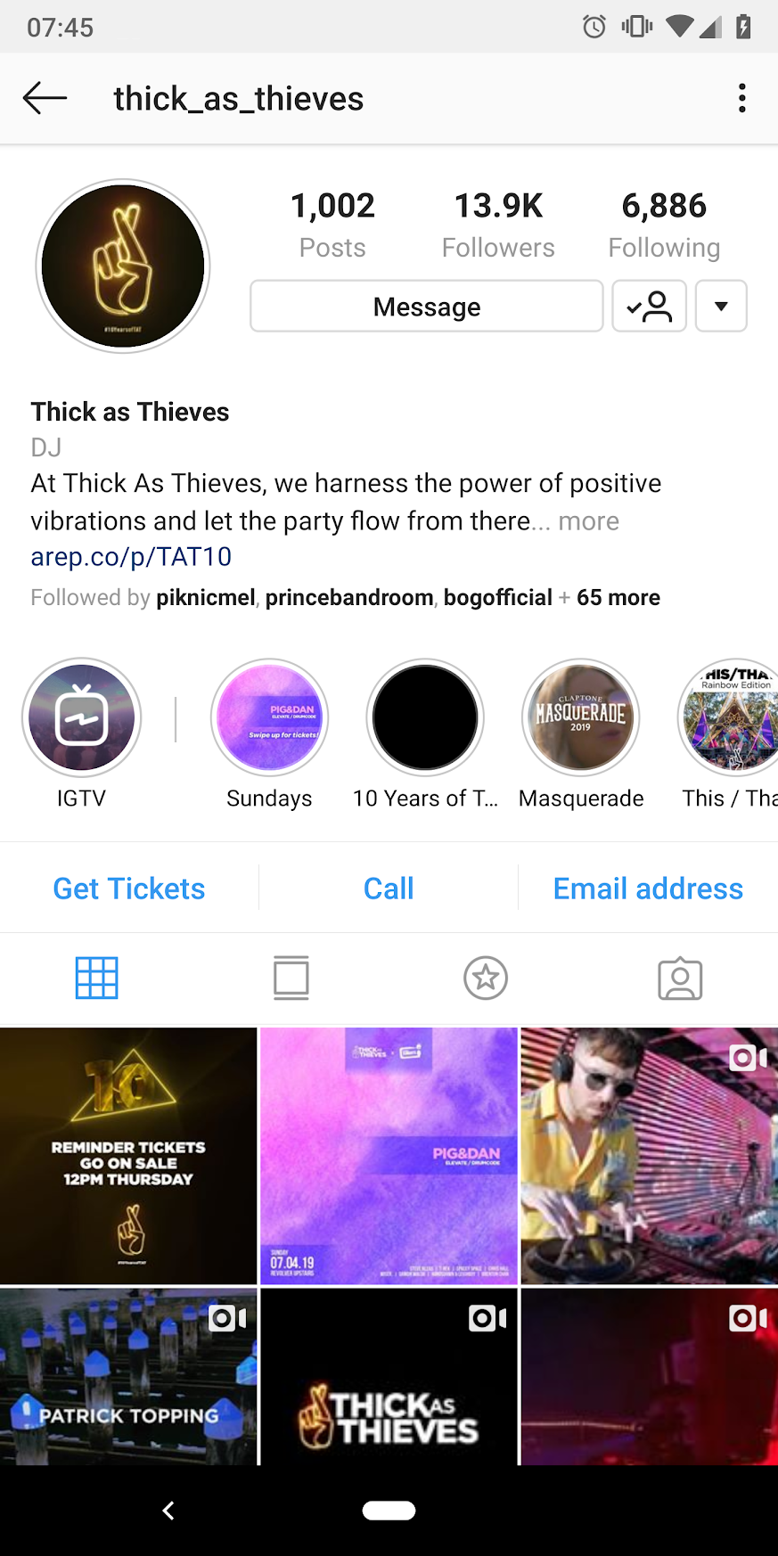
This refreshed identity logo was also used on Thick as Thieves social profile images, shared as a campaign on social media by local DJ’s in the community and attached to all promotional material for the 10 year celebrations.